Visual Communication
WEBSITE, BRANDING + GRAPHIC Design
Coherent visual design, which includes graphics, branding, and identity, is indispensable to a powerful website. This coherence is at the core of all design projects from the digital space to printed publications. We are passionate about bringing these fundamental principles to discussions of color theory, how certain visual treatments or compositions may affect different viewers, and considering how new trends can be read as twists on historical moments. We work closely with our illustrators and photographers to create assets that are legible across multiple platforms.
-
Our team can support your website design (or re-design) needs from ideation to production to maintenance of the site. We provide a range of related services including visual and identity design; user experience design; content writing, accessibility, and search engine optimization.
-
We are committed to the craft of cohesion. We can work with your in-house team to co-create your visual aesthetic and assets from logos and color palettes to graphic elements so that your marketing materials and product packaging fully express your company’s ethos to the world.
-
We love the challenge of breaking down complex, multifaceted flows, functions and concepts into accessible designs and interactions. We are dedicated to understanding your users, who, most likely come to a product with varying levels of understanding and comfort interacting with interface patterns and archetypes.
Website Design + Engineering
VISUAL + UX DESIGN, IMPLEMENTATION (ON CMS OR CUSTOM)
Web Design and Engineering is a core service we provide for project-based work, digital or brick and mortar stores, companies of all sizes, and more. Here are a few samples of website projects and a use case from our work with an e-commerce site.
Contact us for more information about past work or to inquire collaborating with us!
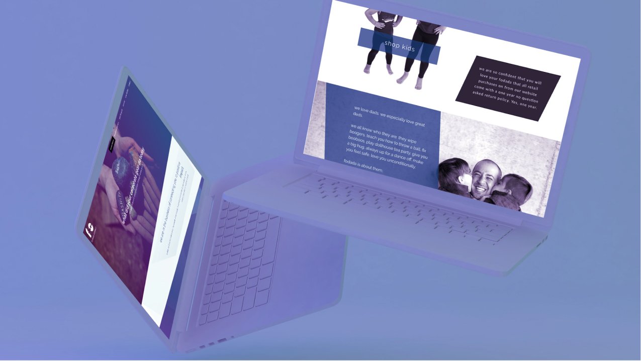
CLIENT: FODADA
fodada is dedicated to supporting fathers and their children through community events and service. This is a sample of the web design and implementation work provided to them.
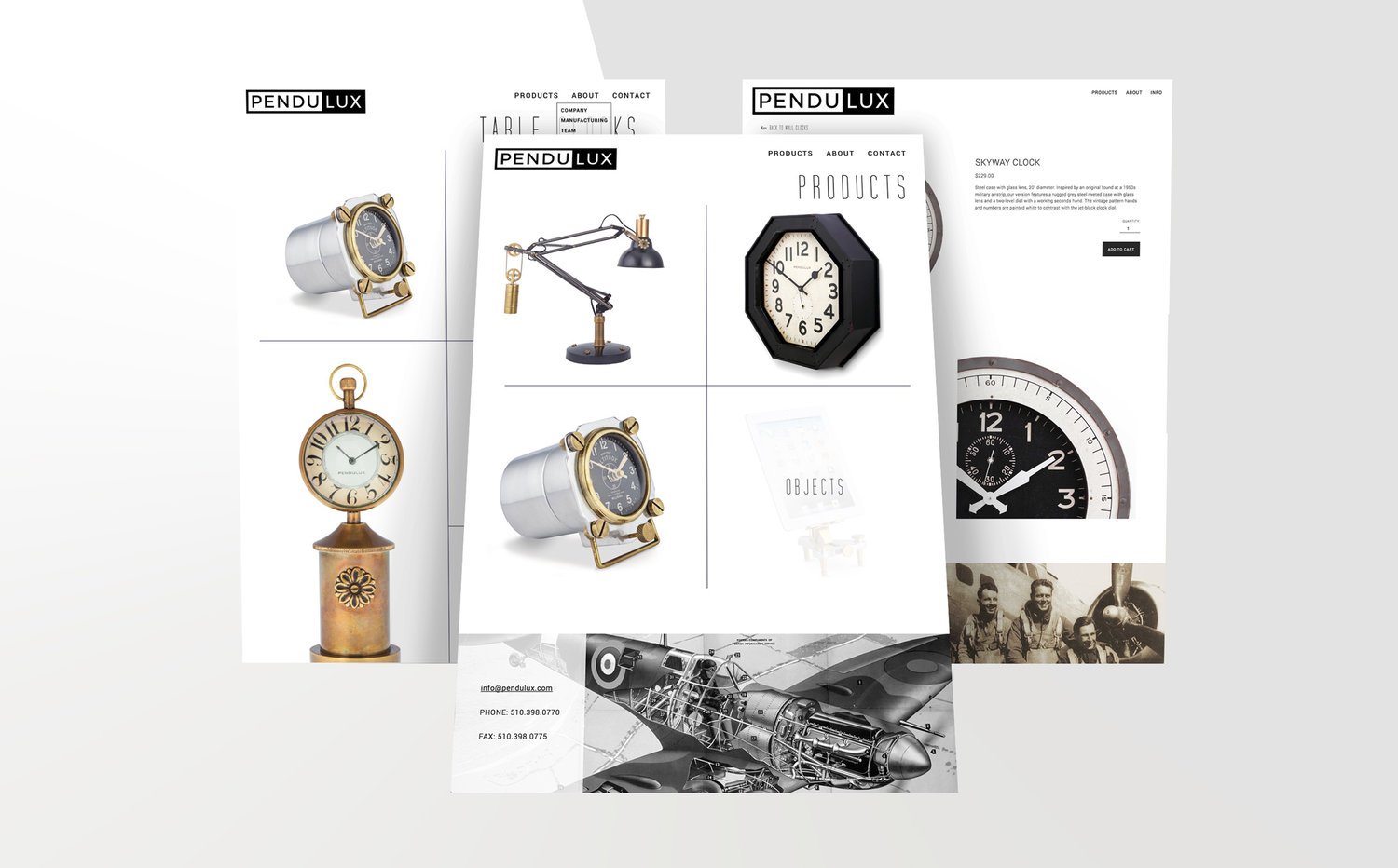
Sample of product portfolio website designed and built for Pendulux, a home goods company specializing in industrial and retro styles.
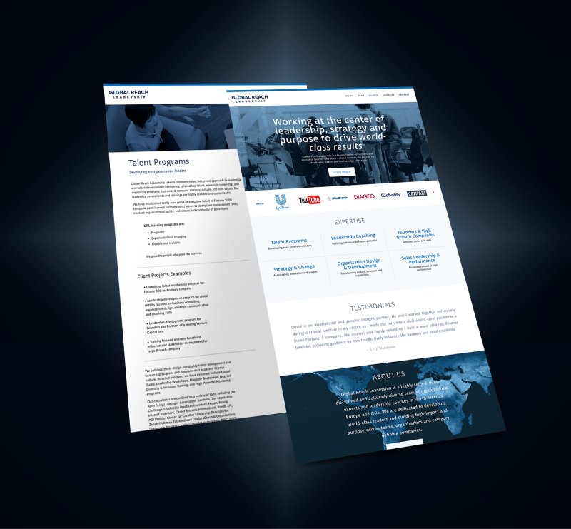
In collaboration with Global Reach Leadership, a consulting company, and their graphic designer, the website branding was extended to design and implement their site.

Sample of the site that was designed and built to highlight children's author, Carolyn Scoppettone and her publications, events and background.

Sample of the redesign of the portfolio website for Arriaga Masonry, a masonry company that works on landscapes and interiors.

Sample of the site designed and built for Chiori Miyagawa, an award winning playwright.

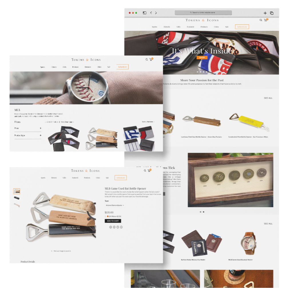
Client: Tokens & Icons
PROJECT: E-COMMERCE RE-DESIGN
Tokens & Icons is a men’s gift maker and retail shop. In 2021 our team started discussing a website re-design. In working on their marketing campaigns, our team identified website modifications that could facilitate increased campaign success. We incorporated our findings and the client’s needs, ideas and observations into consideration when planning the re-design. Not only were we able to use our marketing insight to focus on end customers’ needs, we were also attune to solving the client’s in-house pain points in working with the Shopify admin and CMS. Our expertise in Shopify allowed us to build and execute a customer-centric architectural plan and, simultaneously, a framework that met the needs of the client’s in-house team regarding managing and updating the CMS and fulfilling orders. During the design process, we created flow charts and pixel-perfect mock-ups to facilitate collaboration between our team and the client. We provided creative direction on visuals and copy in order to effectively convey the products’ value, lineage, and use. We custom engineered Shopify template to make the most of Shopify’s liquid tags, metafields, and infrastructural features in order to meet all goals while limiting the use of third party applications.
Example of Home Page Improvements
More Design Solutions
Information Architecture
Increased visibility and filtering functionality of variants (teams, artifacts). With a catalogue of over 1000 products, shoppers were able to more easily find available stock and purchase their desired items once more categories, uses, and themes were exposed.
Easy CMS Maintenance
Made it easier for client to modify site which included the ability to create relevant landing pages for marketing campaigns.
Pre-order FUNCTIONALITY
Added ability for customers to more easily purchase out of stock items via waitlist.
ROBUST VISUAL Navigation
Expanded options and increased nested navigation layers so customers could more quickly understand the breadth and depth of the product offerings.
Context INTEGRATED WITH SHOPPING
Integrated stories into collection and product pages to highlight the authenticity, quality, care, and brand partnerships that made the products unique and special.
Identity + Branding Design
LOGOS, ASSETS + VISUAL DESIGN
Brand development is a key part of expressing a company’s voice, vision, and value proposition. We look forward to helping clients fully express their brand’s ethos through logos, color palettes, typeface combinations, motifs and patterns. Our team can help build your brand’s identity with aligned photography, audio, software and more.

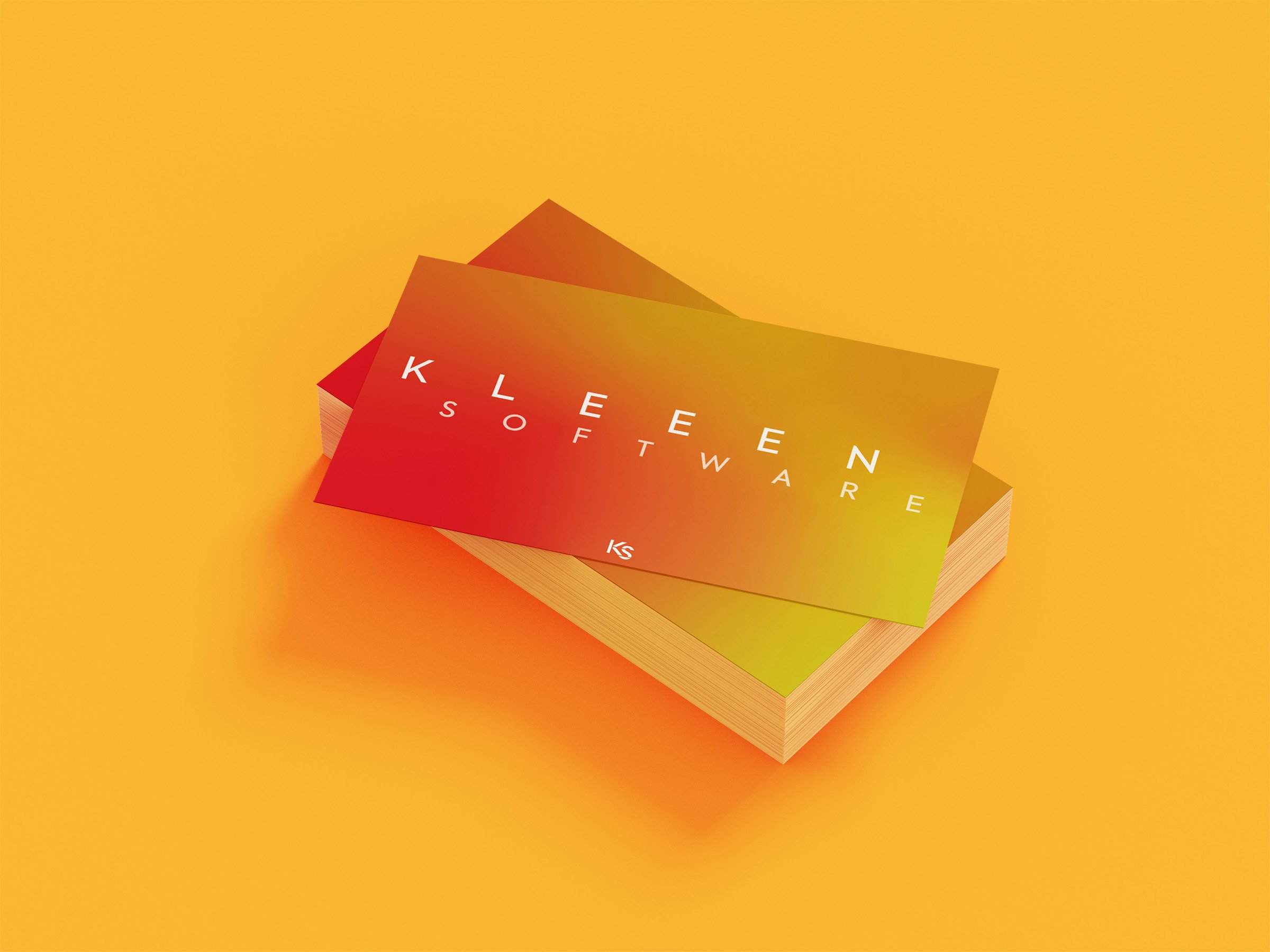
Company: Kleeen Software
The designs for Kleeen Software’s marketing site were created iteratively along with the process of expanding and solidifying the brand’s identity. Since the goal of the product was to auto generate UI components in the appropriate layout and flows to be responsive to user needs, architectural and infrastructural imagery were used as analogies to communicate the brand’s commitment to supplying the foundations of good design experiences.
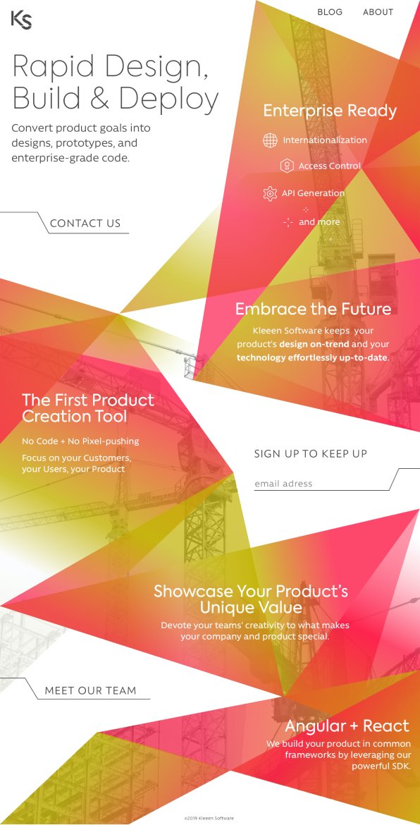
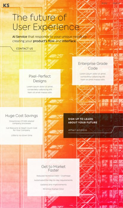
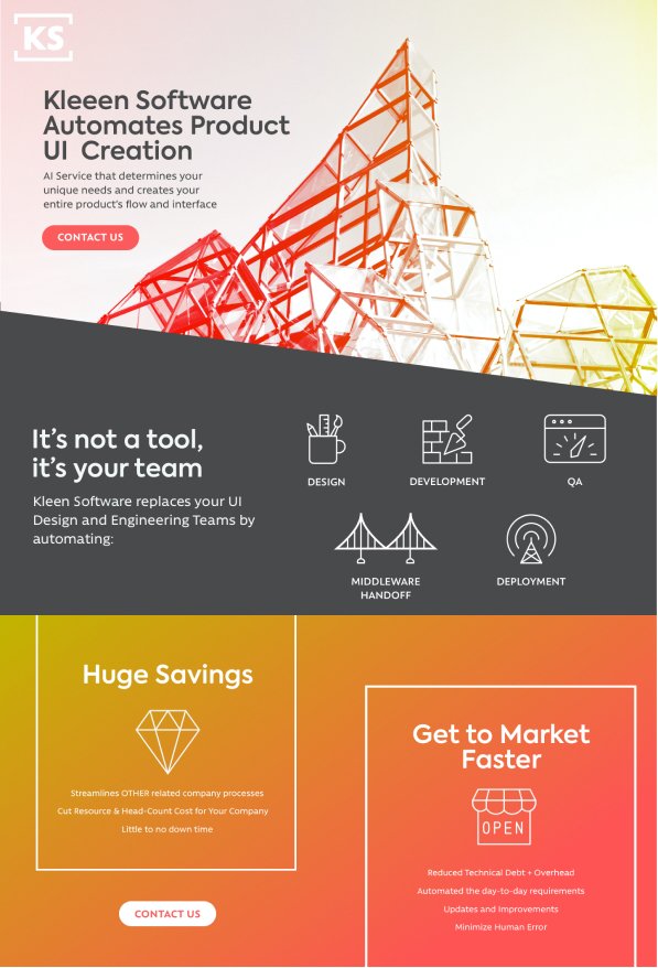
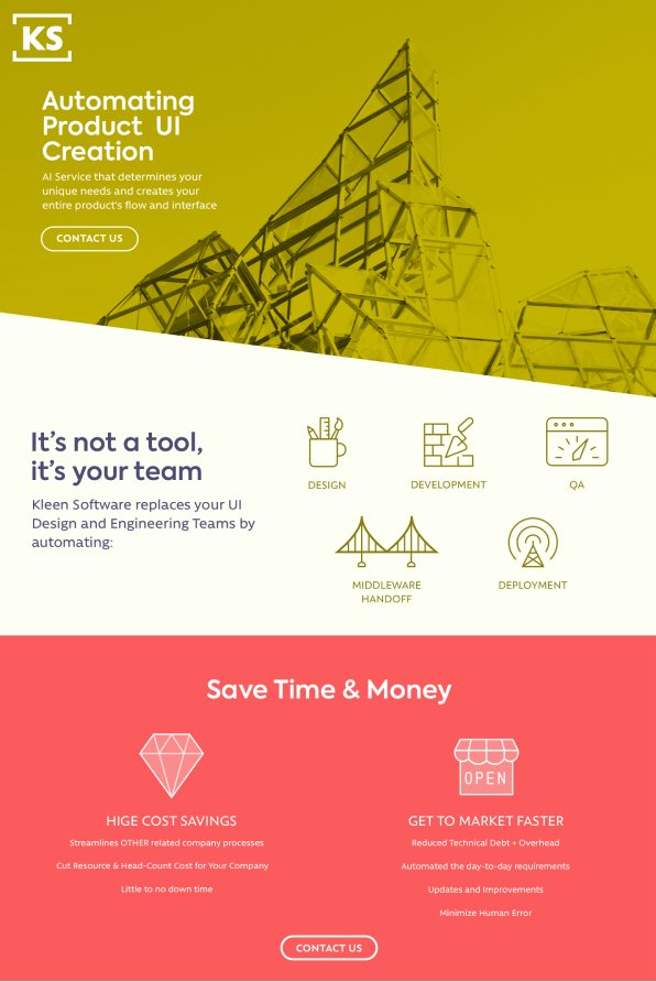
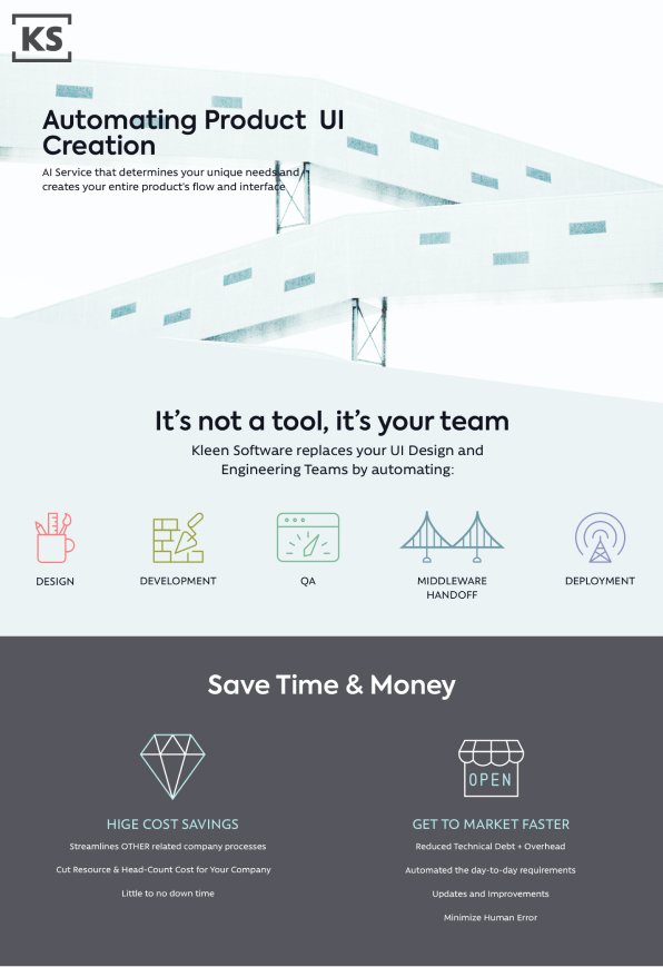
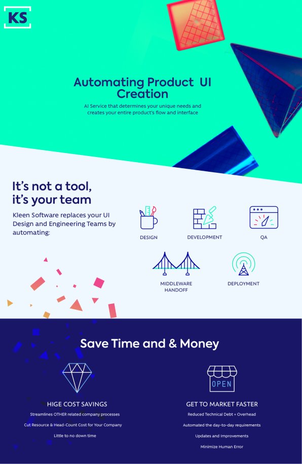

The largest image at the top was the final design for Kleeen Software’s business cards and extended logo. The other designs were previous iterations that played with the building and component metaphor: either “constructing” the brand from geometric components or using the letters to create a visual pattern. In the final design, a multi-noded gradient provided a warm ambiance, implying a fluidity and holistic approach that distinguished the brand from the flat, cool-colored tech aesthetics of that moment.


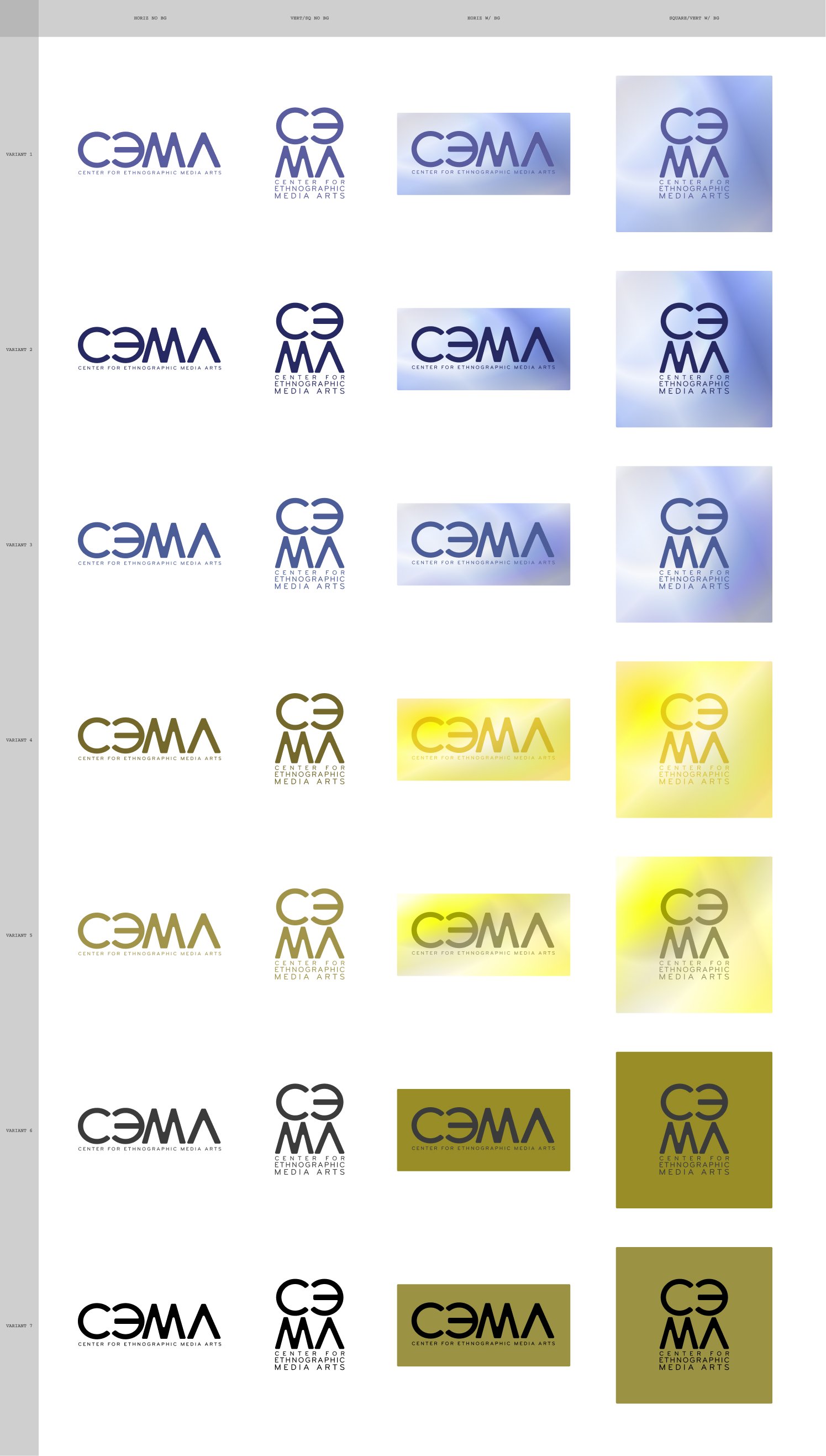
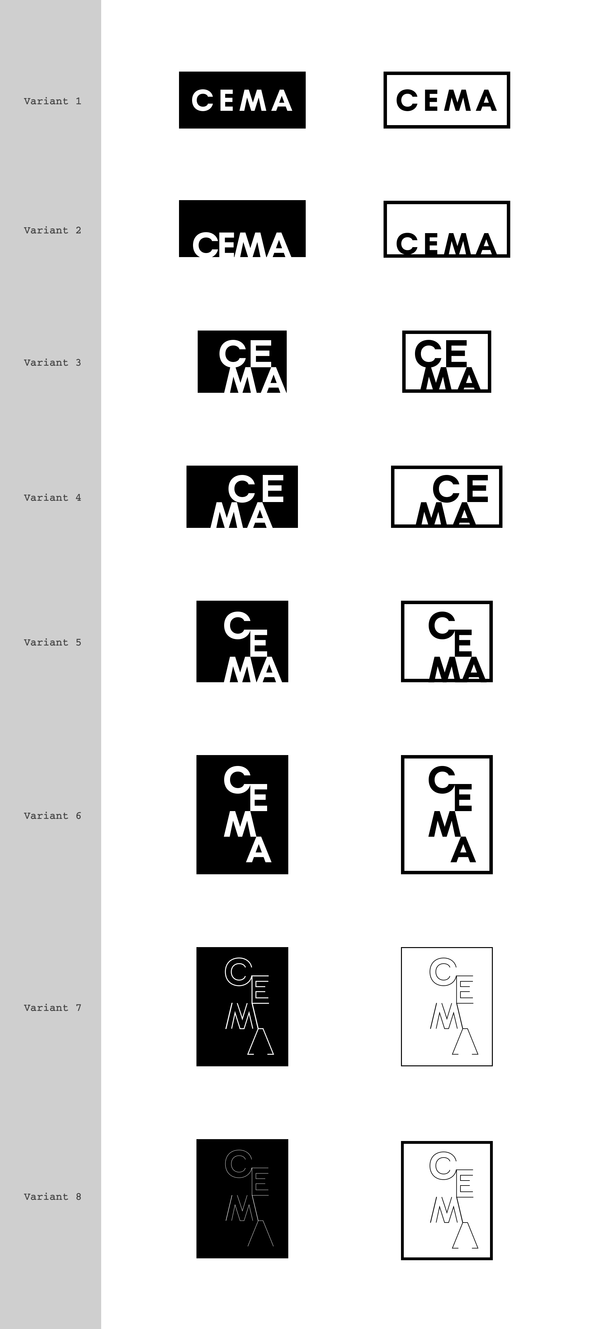
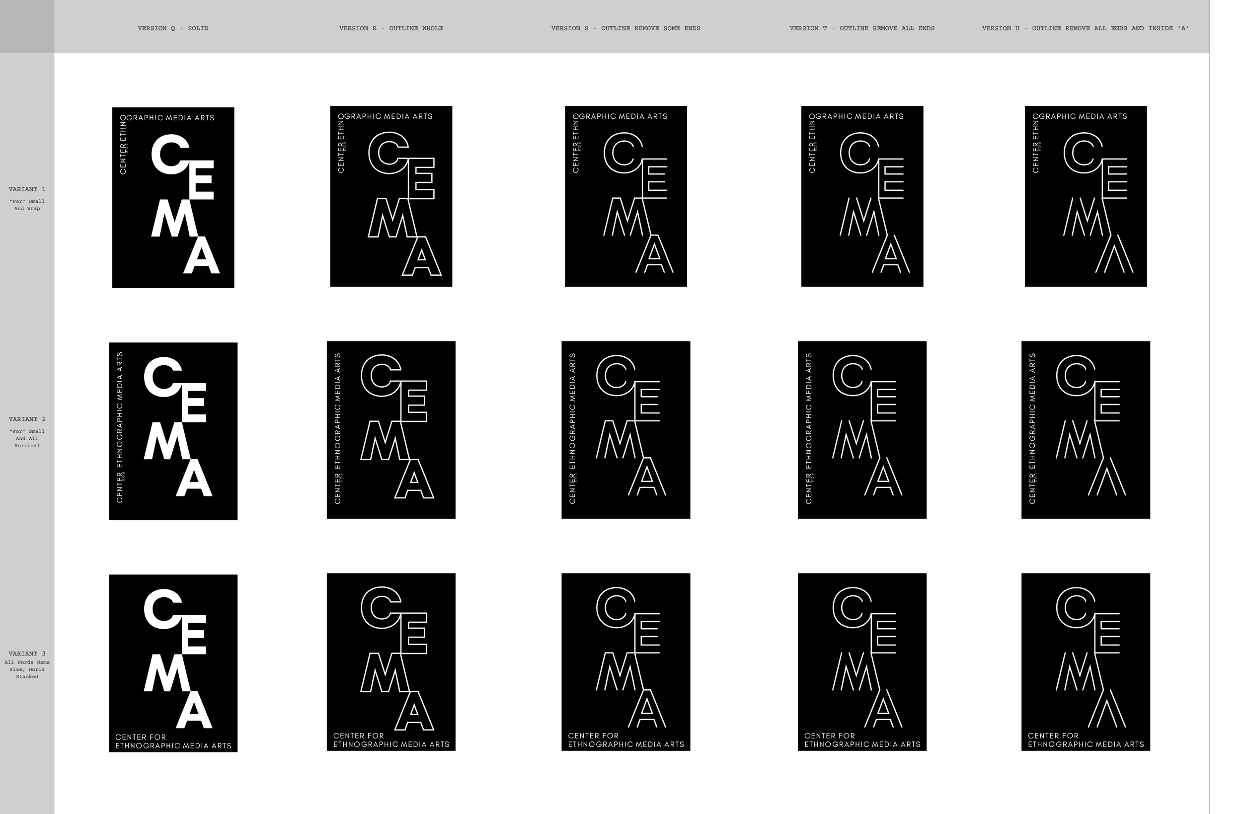
Client: CEMA (Center for Ethnographic Media ARTS) at University of Southern California
We worked with the Director of the Center for Ethnographic Media Arts at USC, create a logo, visual identity, and website to mark the center’s transition from the Center for Visual Anthropology.
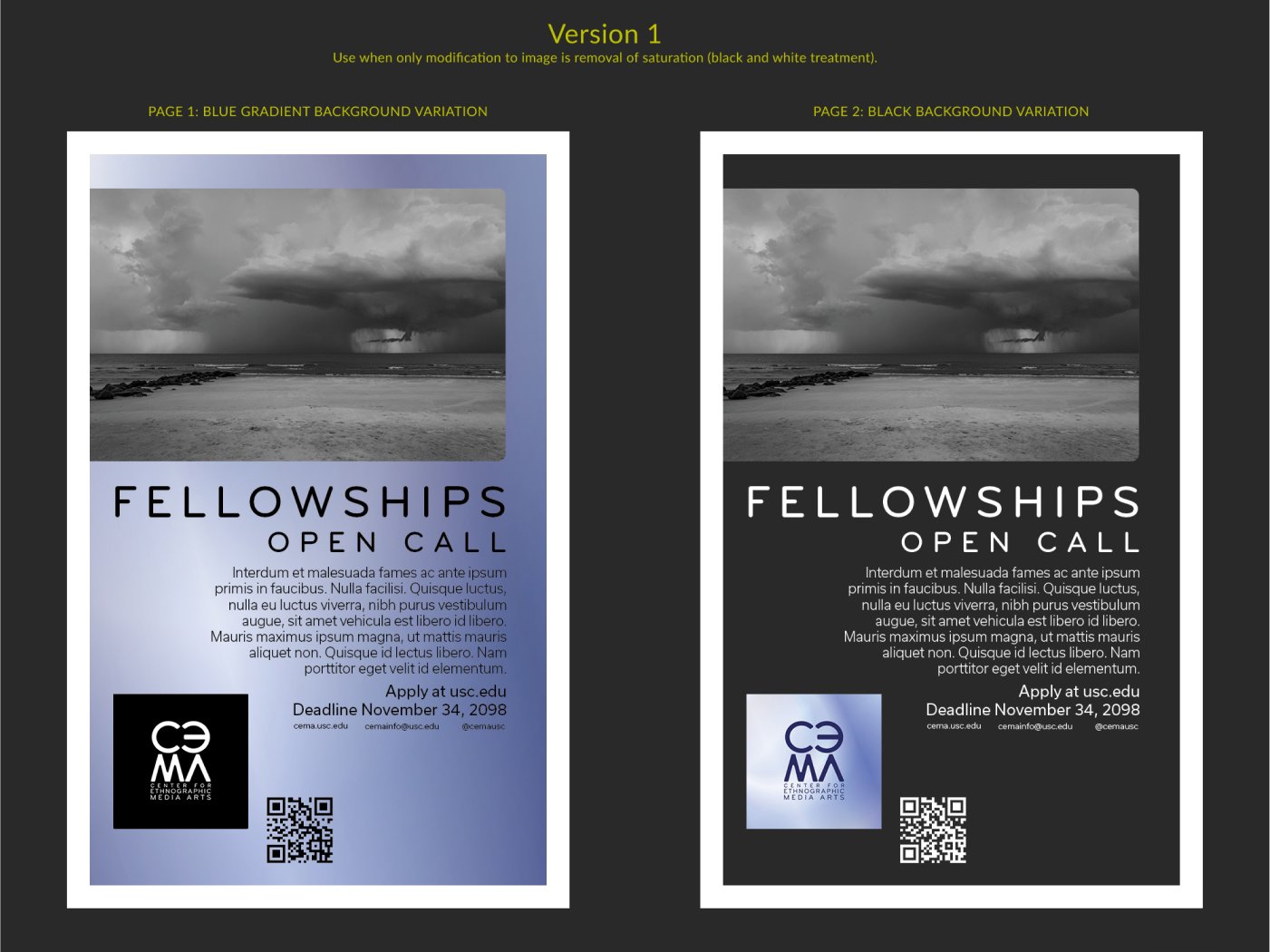
When creating brand identity, we believe in fluidity and context. While we want audiences to gain brand familiarity through consistency, we also want to provide visual options for the brand logo in different usage environments. For example, in the case of CEMA, a black and white logo was required for placement in film credits, while the gradient versions of the CEMA logo were the best options on digital media. We also provided a flat, dark blue variation to keep the color story intact incases where the reproduction or print quality was low or when the view of the logo was small.

We provided a simple color palette and header and copy fonts for the brand’s print collateral, digital marketing, and more.
The Iterative Process
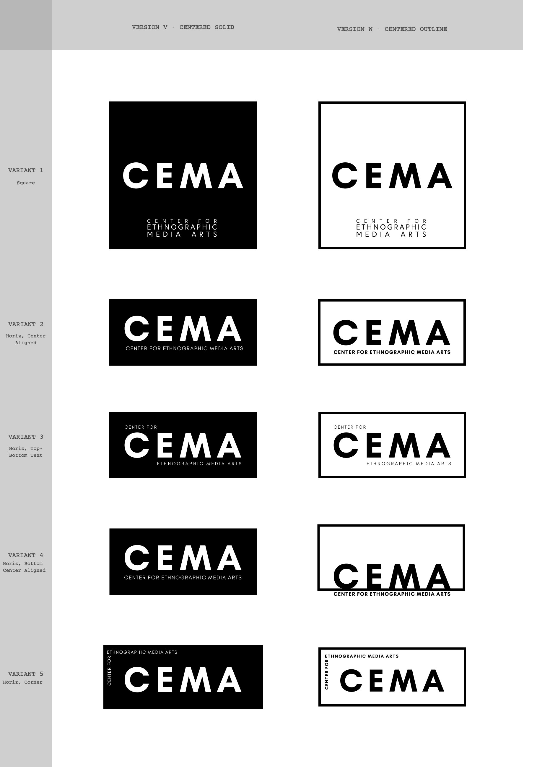
We create everything collaboratively and iteratively. The charts below represent rounds of iterations, explorations within different aesthetic approaches, and color directions that are a part of our process. In general, our work starts with a variety of options based on research and the needs of the client. As iterative rounds progress, some designs are dropped and some are explored in more detail. In the case of the CEMA logo, we took care to explore the spacing between all letters, the roundness of each corner, and specific tints and shades of a color as we narrowed to the final logos.
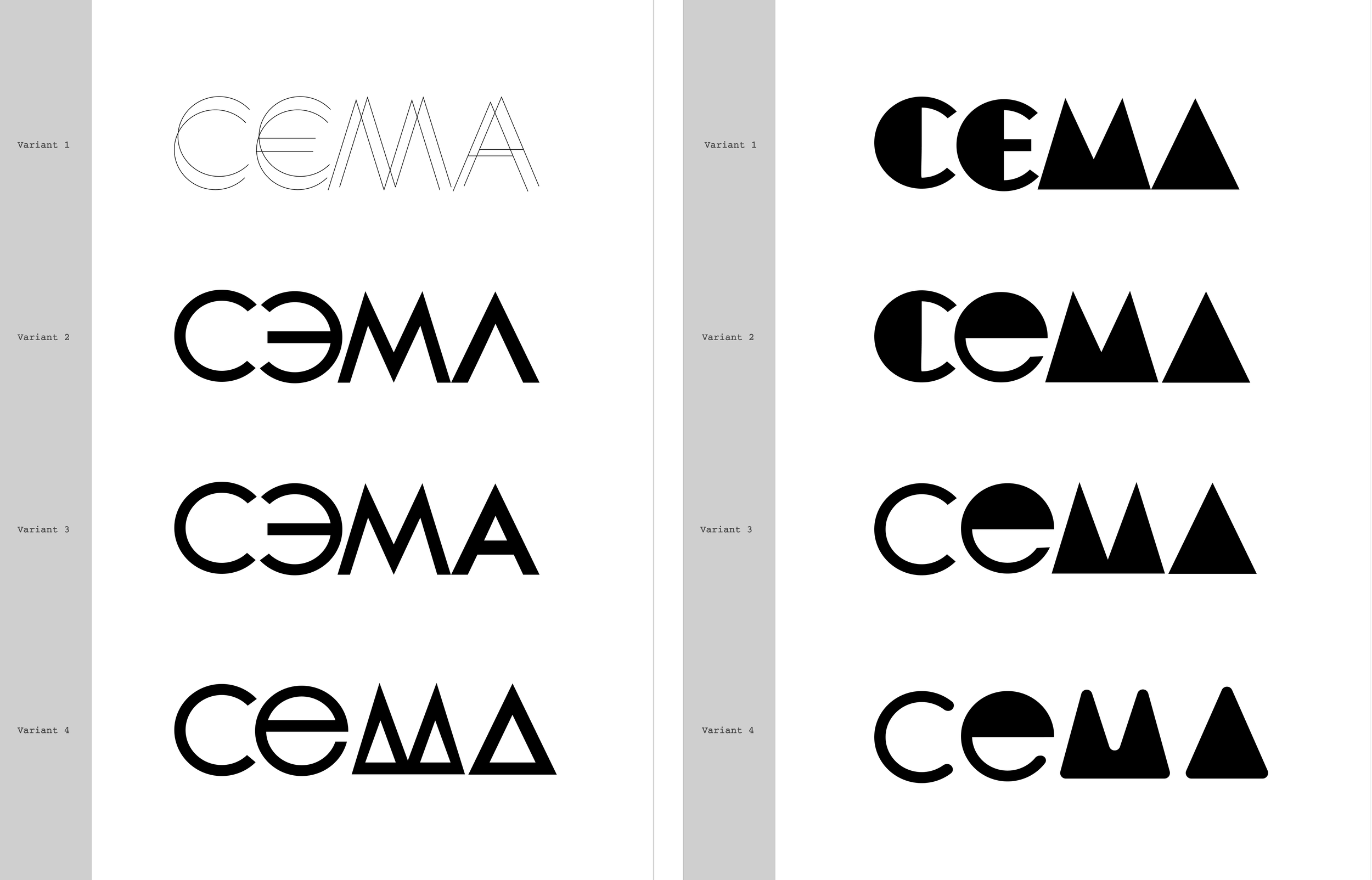
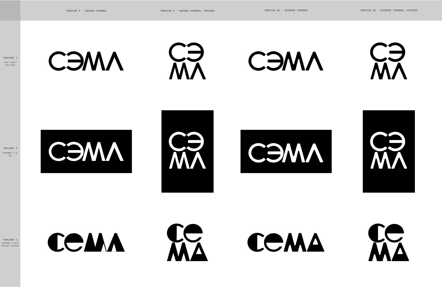
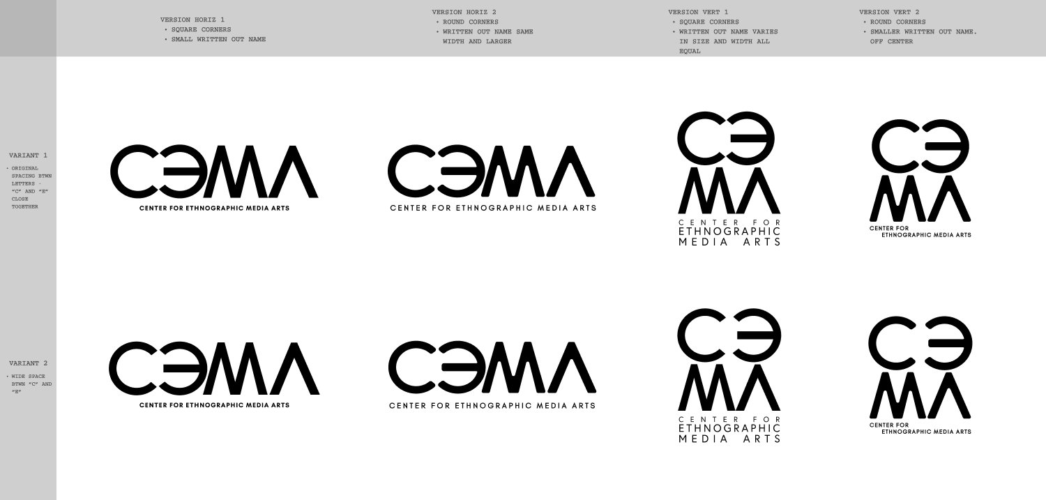
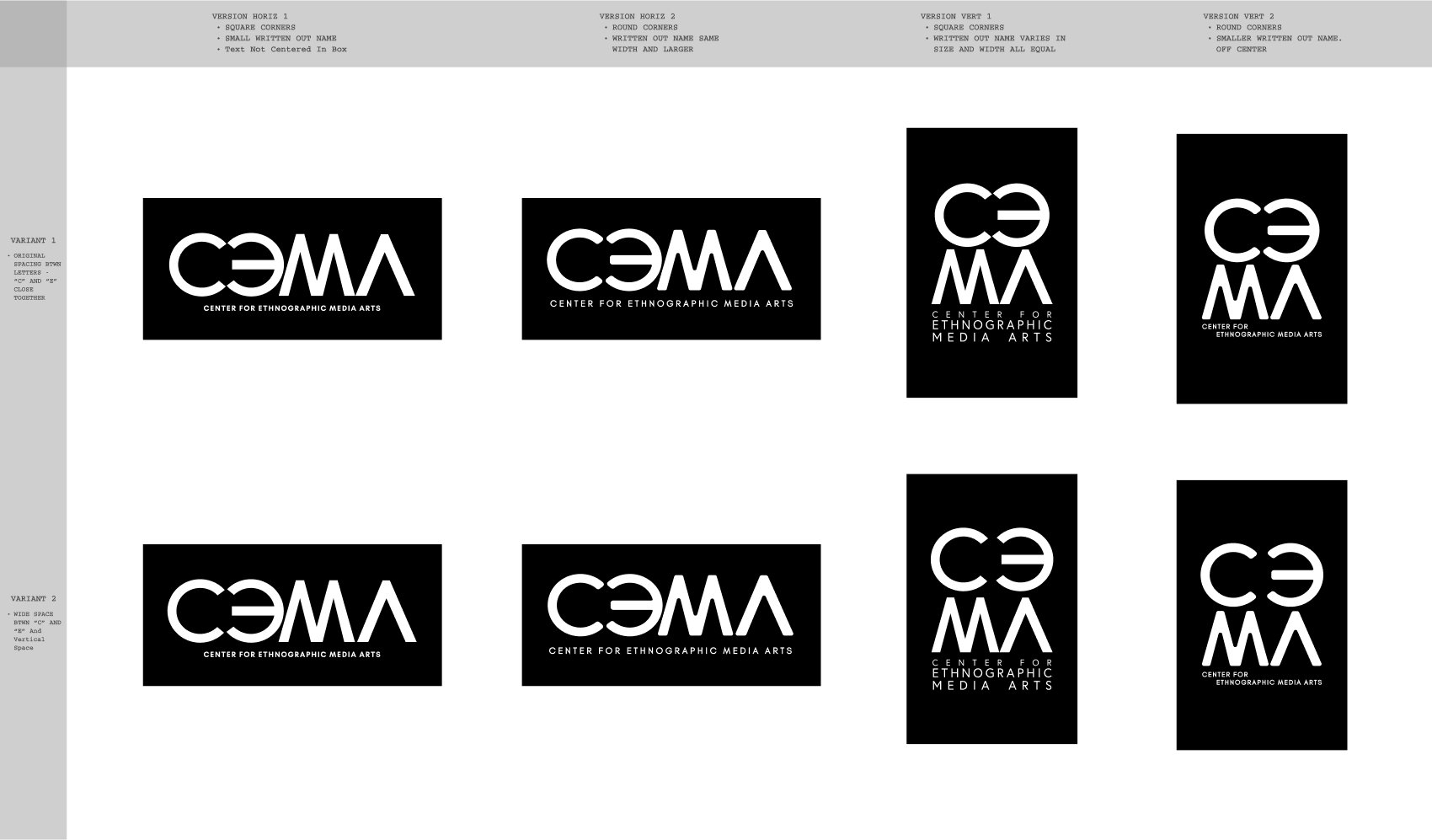
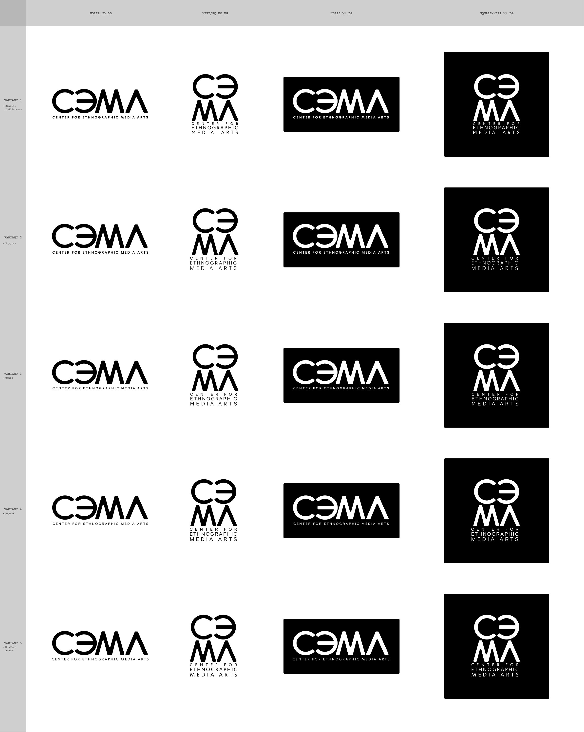
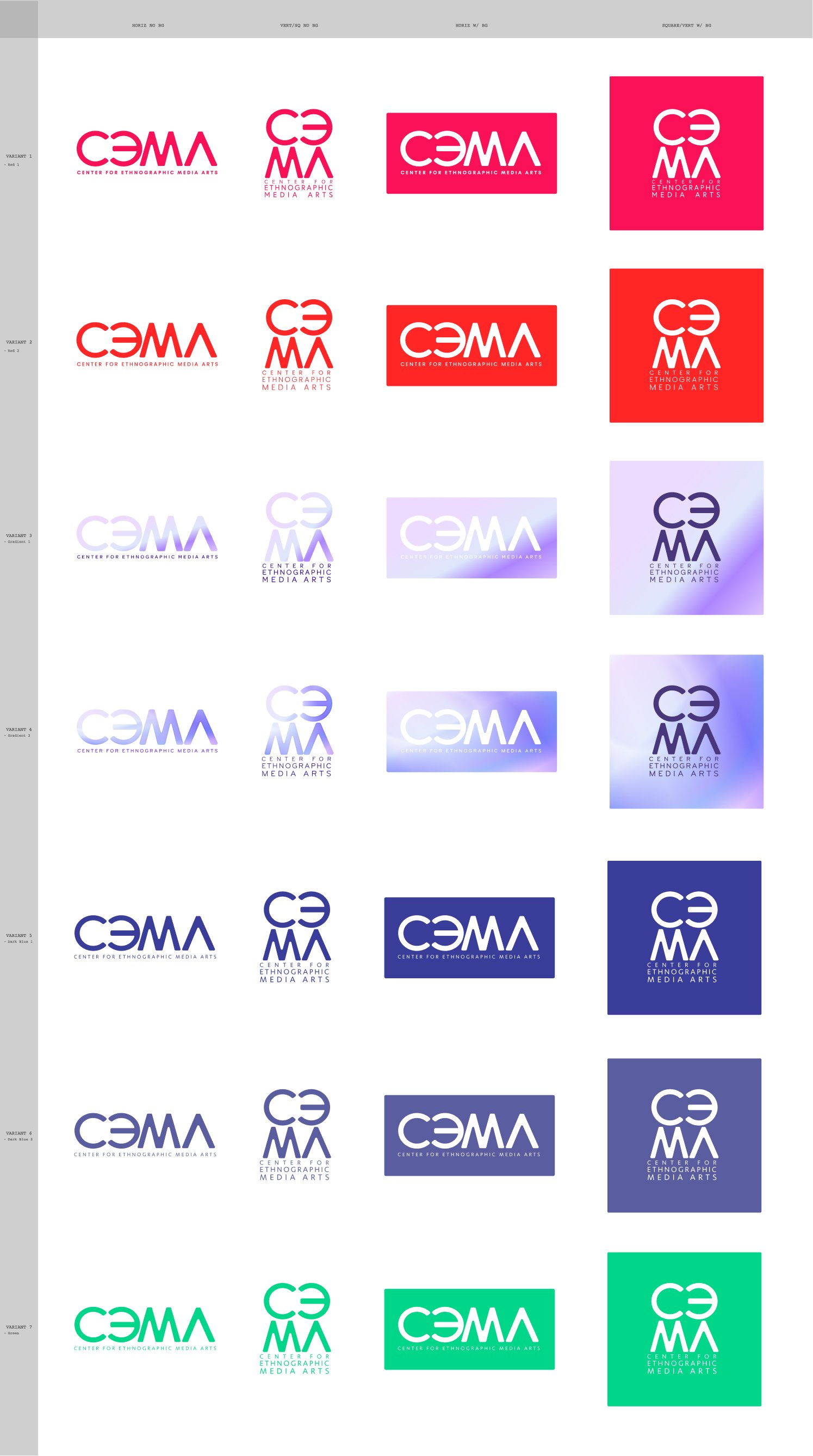
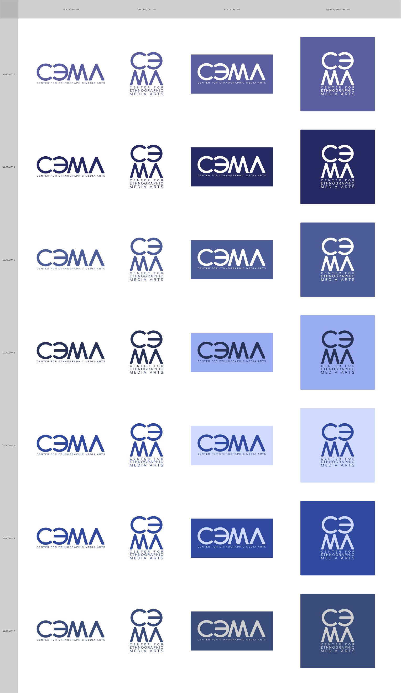
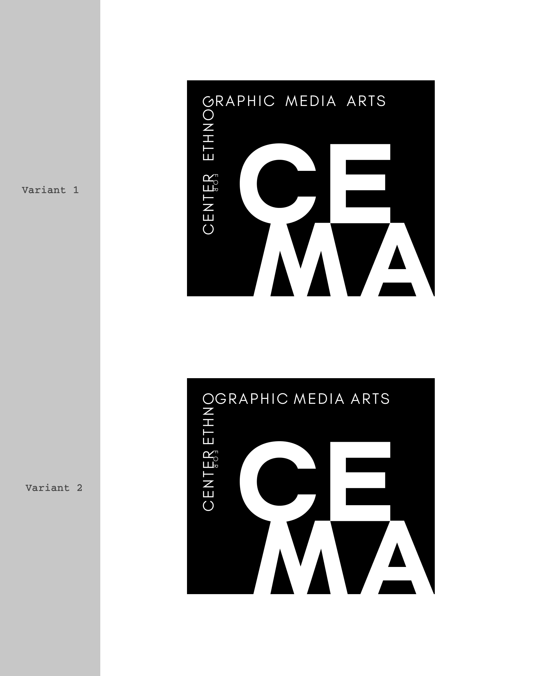
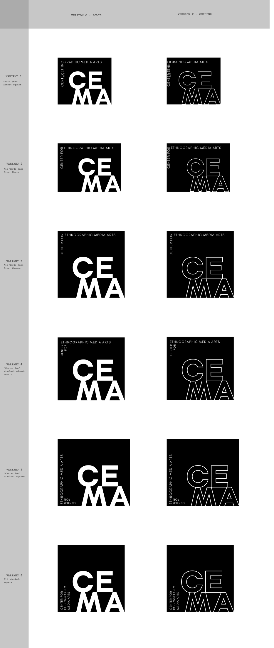
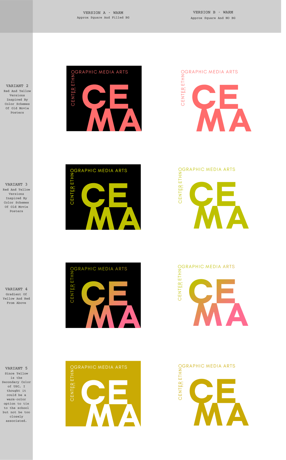
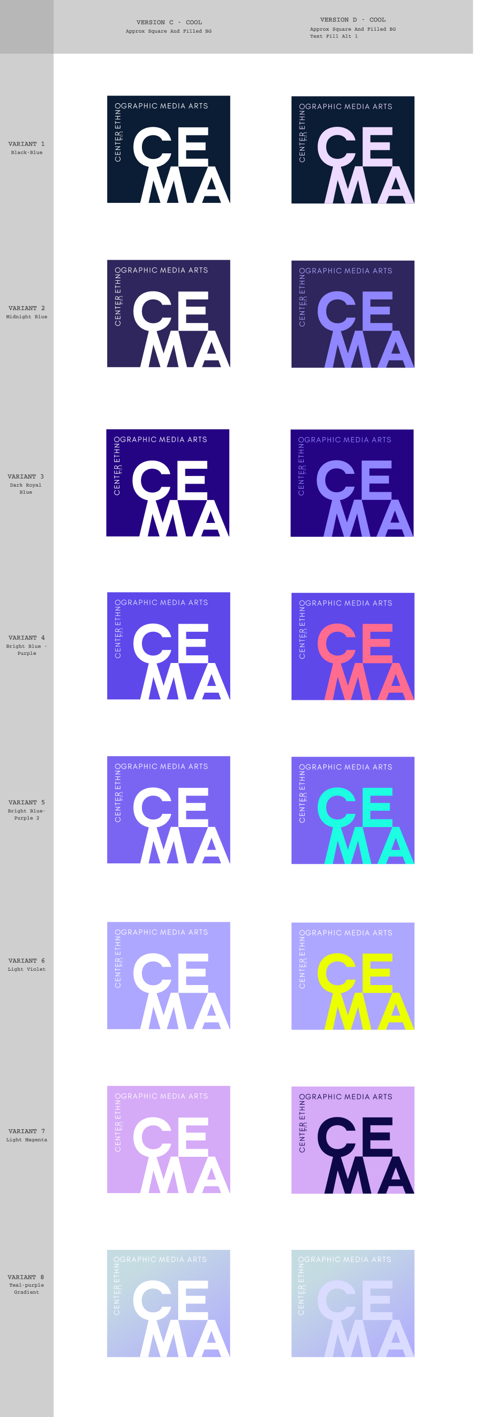
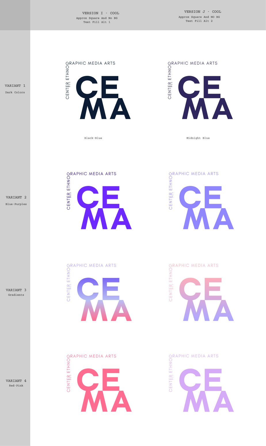
Other iterations were done at the same time as the ones that would become the final logo. The compositions, typefaces, approaches, and color explorations of these options, guided us to the final logo designs. In both examples, the successive iterations are to the right of the previous creations.

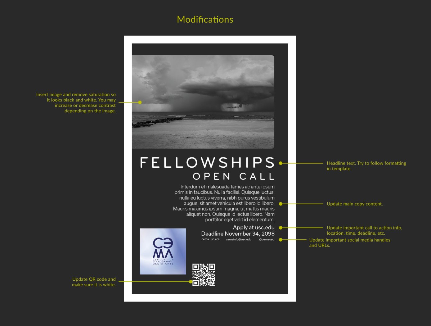
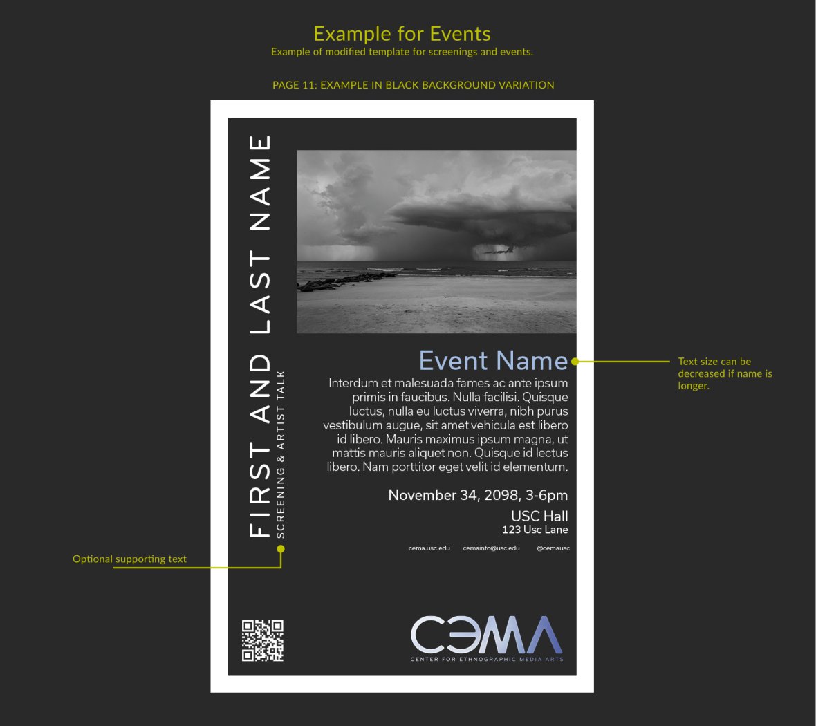
The poster templates below include variations and instructions created for the client to customize for events and open calls. The templates were made in Adobe InDesign and packaged for the client.

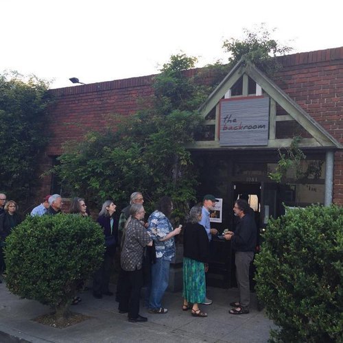
Client: The Back Room
With a clear idea of an overall aesthetic and color, this local music venue in Berkeley, CA, wanted a logo and a visual identity. Multiple variations and visual options were created using the client’s instructions. The final design requires a number of modifications to specific curves and gestures that could mimic original handwriting while also maintaining clarity and uniformity.
The client created an outdoor wooden sign that featured a square version of the logo. The full, horizontal version of the logo was featured on an indoor sign as part of the stage’s backdrop.