
Product Design, Research + Engineering
UI/UX, Desktop + Mobile Software, Design Systems
We believe thoughtful design is driven by an awareness of cultural, historical and psychological contexts. This means that when we are designing and engineering for software products, websites, visual identities, and more, we are cognizant of which aesthetic, functional, and environmental components are necessary to connect with an audience.
Our team’s philosophy is augmented by our ability to approach design from a variety of perspectives and experiences. We can analyze and align the multilayered needs of our clients and end-engagers (often referred to as end-users) as they both interact with the work. We embrace a shared clarity of vision, research, and mutual empathy as pathways to productive processes that can be mirrored in the final product.
Our Specialties
-
We love the challenge of breaking down complex flows, functions and concepts into accessible designs and interactions. We make complex systems digestible for users who come to products with varying levels of understanding and comfort.
-
Our approach to mobile app design focuses on unifying usability, accessibility, engagement, and the users’ environment. We work towards form and function, moving in harmony to create the best experience for those trying to complete a task, be entertained or solve a problem away from a desktop environment.
-
In conjunction with product design, we provide the necessary structures, libraries and documentation for a custom design system that supports your software’s ongoing consistency and growth. We create collections of reusable icons, semantic UI components, and how-to guides for pattern and design approaches.
-
Our team can provide comprehensive user research, including data analysis, interviews and qualitative analysis, to help you understand your desired or current audience. We can also audit your product and conduct competitive research to understand the trends and expectations users have within your vertical.
-
Our team can support your web, branding and visual design needs in tandem with marketing efforts to launch your product, app, event and more.
Within complex digital projects, we work collaboratively at each of these stages:
Conduct user research, create user personas, analyze quantitative engagement data to provide design recommendations
Audit and restructure your existing products, designs, content, etc.
Create flow charts, architectural frameworks, design systems, wireframes, and iterative pixel-perfect mock ups.
Provide interaction design, micro animations, delightful ways to incorporate movement, feedback and sound into moments of engagement.
Creating or incorporating existing brand materials and multimedia visual design.
As artists, we are well versed in both the contemporary trends and historical movements of film/video, photography, sound, music and visual art.
We can provide the most strategic and appropriate aesthetic treatment to elevate any aspect of your organization’s visual identity.
Engineer and Implement your digital product on an existing platform or develop from the ground upward.
Our designers and engineers have both architected and developed software products and sites from just nascent ideas and have worked with clients to revamp and upgrade their existing digital presences.
If you prefer to build on a platform such as Squarespace or Shopify, we can not only customize it to align with the design and goals, but we can also provide documentation and training so you and your team can eventually have full control.
If you prefer to use your in-house developer, we can provide collaborative project management and extensive documentation to help communicate the design vision.

Visual + UX Design, pixel perfect mock ups
Software Design
Client: Aruba Hewlett-Packard Enterprises (HPE)
PROJECT: GLOBAL SETTINGS
Aruba HPE offers security solutions for monitoring, maintaining and fixing the large-scale networks installed on campuses, in offices and more. This multilayered product design project involved creating cohesive Global Settings, Home Page, Login screens, and Onboarding experiences so that users could conceptualize and interact with multiple then-separate, but related, applications as a unified suite of security product offerings. The accessibility of introductory flows was of highest priority so that all users, regardless of their levels of experience, would immediately be able to gain control of and insights into their networks.


Screenshots of the designs at the beginning of project
Approach & Context
White boarding sessions with PMs to work through specifications was the first step in designing and redesigning each project and flow. Engineers were also consulted as they provided understanding of use cases. The most useful questions to determine the most appropriate data visualization and display mechanisms, were as follows:
How often will users need to see x-data and what is the context when they do?
What are the parameters of x-data and what are the most likely scenarios for and values of this data?
What is the scale of this data?
When and why would it be best for users to see the aggregate (total, average, change in) values? What are the characteristics of the data points that make up the aggregate and, given that, what are the users’ needs and expectations regarding the relationship between the aggregate and the disaggregated data?
What types of actions need to be made on the data? How often do users perform these actions and what are the contexts of these actions?
What are potential future parameters or functionalities that may be added so solutions can be as easily modified when scale increases?
Challenges and Goals
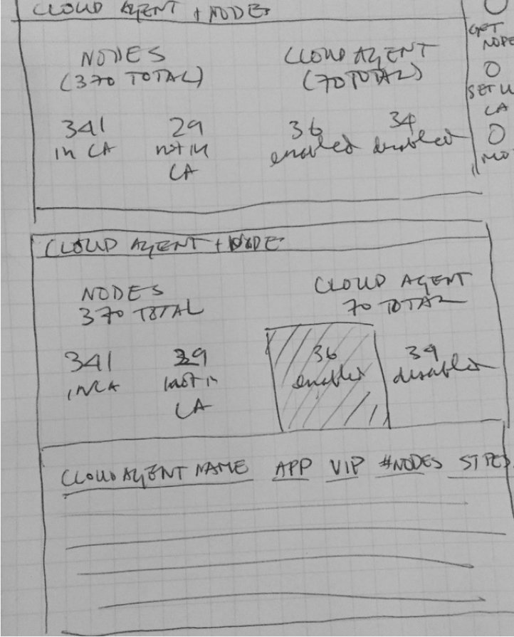
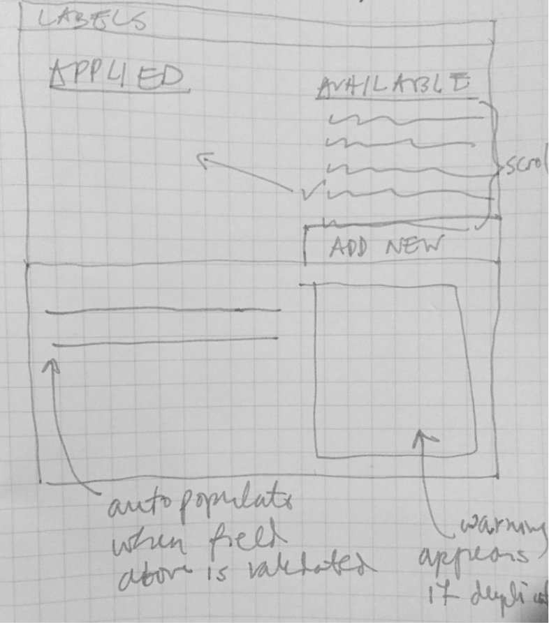
n all Aruba HPE applications, the concepts of subscriptions, users, devices, etc. were conceptually common and shared between products. However, when this project started, the functionality and experience of each product’s settings was siloed. This meant that each application had its own designs for presenting and interacting with those objects and concepts. To rectify this, one of the project’s key goals was to create universal Global Settings by:
Visually clarifying objects and actions that were universal to all products and allow users to treat them as such.
Creating efficient and focused designs so that users could easily input and find information
Displaying high-level stats and most important information at a glance
Demystifying information so junior engineers could easily understand the basics of their systems’ components
Deliverables
Deliverables included pixel perfect mock ups, prototypes through InVision and design specifications documents on the client’s internal platform. Each design included complex data visualizations that allowed for progressive disclosure so that users could easily see aggregated data (such as a pie chart) and its relationship to disaggregated data (often viewed in a table).


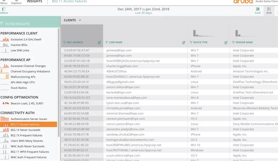
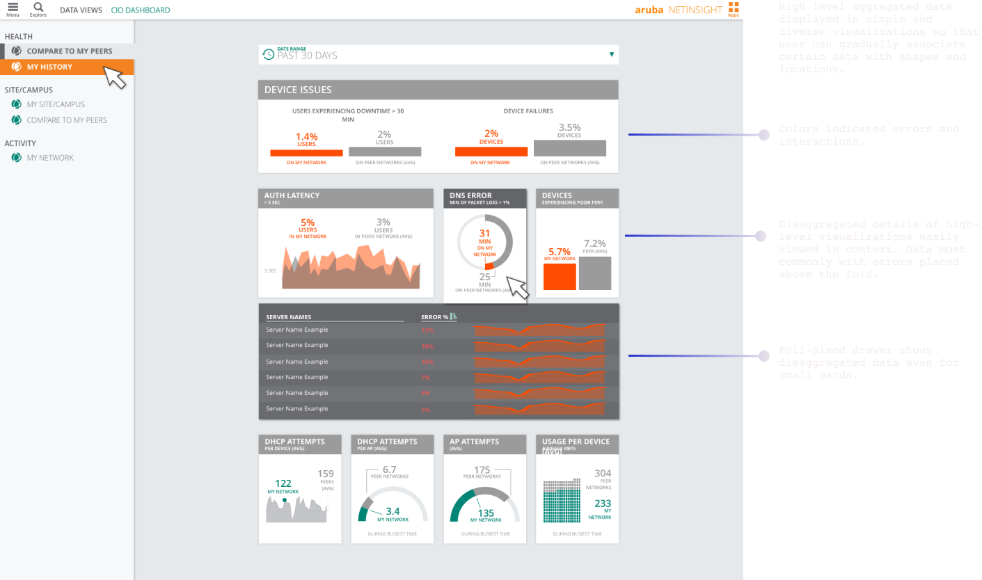
Project: Monitoring Dashboards
This application within Aruba HPE focused on monitoring the activity of networks, alerting users (network engineers) to potential issues, and providing different sets of information to different users (multiple levels of engineers). The goals were:
A dashboard showing multiple stats and comparisons at the highest levels.
Users need to immediately recognize the presence of network errors or problems.
Users need to be able to simultaneously and immediately see both disaggregated and aggregated data in the same context.
Deliverables
All visualizations and data that related to errors or failures were displayed in red so that users could recognize them as the most pressing issues. Visualization areas with no problem are indicated in grey to not attract the eye.
Used multiple types of data visualizations to prevent the user from feeling overwhelmed by the data and to express the data in the most direct and accurate manner.
The CIO Dashboard employed multiple different main card sizes (established in the Design System), which allowed data to be organized by value. The placement of the cards reinforced the relationships between data. For example, the most important error-related information, was in the top two rows above the fold. The top two most important data groups were in the same card, ‘Device Issues’, indicating their close relationship.
No matter the card size, all clickable content opened a full-sized drawer. This allowed ample space – while still in context – for the user to see the disaggregated information. This was a new concept added to our Design System.
VISUAL DESIGN + UI/UX PROCESS
Mobile Application Design
Outlined is a sample of mobile application projects highlighting the process of user experience flows (visualized in flowcharts), wireframes, and visual mock ups. For more information about the process and these past projects, reach out to us.

Client: Churn
Churn was a mobile app designed to help people find homes for their beloved but unneeded objects. After researching competitors and target users, consensus determined that UX flows would be inspired by then-popular apps to decrease friction in use, especially for older audiences. Common micro interactions and gestures were explored to leverage well understood interactions in order to keep usability high while adding touches of unique visual designs. We explored multiple visual approaches, and marketing aesthetics, that would capture the attention of target users.


Client: Branchtime
Branchtime’s focus was to help users break down tasks to achieve their goals. This was a redesign project of the already implemented UX/UI. The the desired end result was to incrementally improve the flow and visual design based on user feedback.
The wireframe sample exemplified the process of simultaneous upgrading the visual UI design while mainly focusing on adjustments to UX flows. Iterations of wireframes were created every few days. While we do not usually work on visual design while still heavily experimenting with the UX, many start up environments that are limited on time and resources, have to multiply focus. With Branchtime, the circumstances called for a pivot to augmenting the flow to optimize for user experience while also chipping away at the visual design. Some screens remained unchanged (based on agreed upon priorities for all stakeholders) so that the whole team could focus on the most valuable and realistic actionable changes for the engineering team.


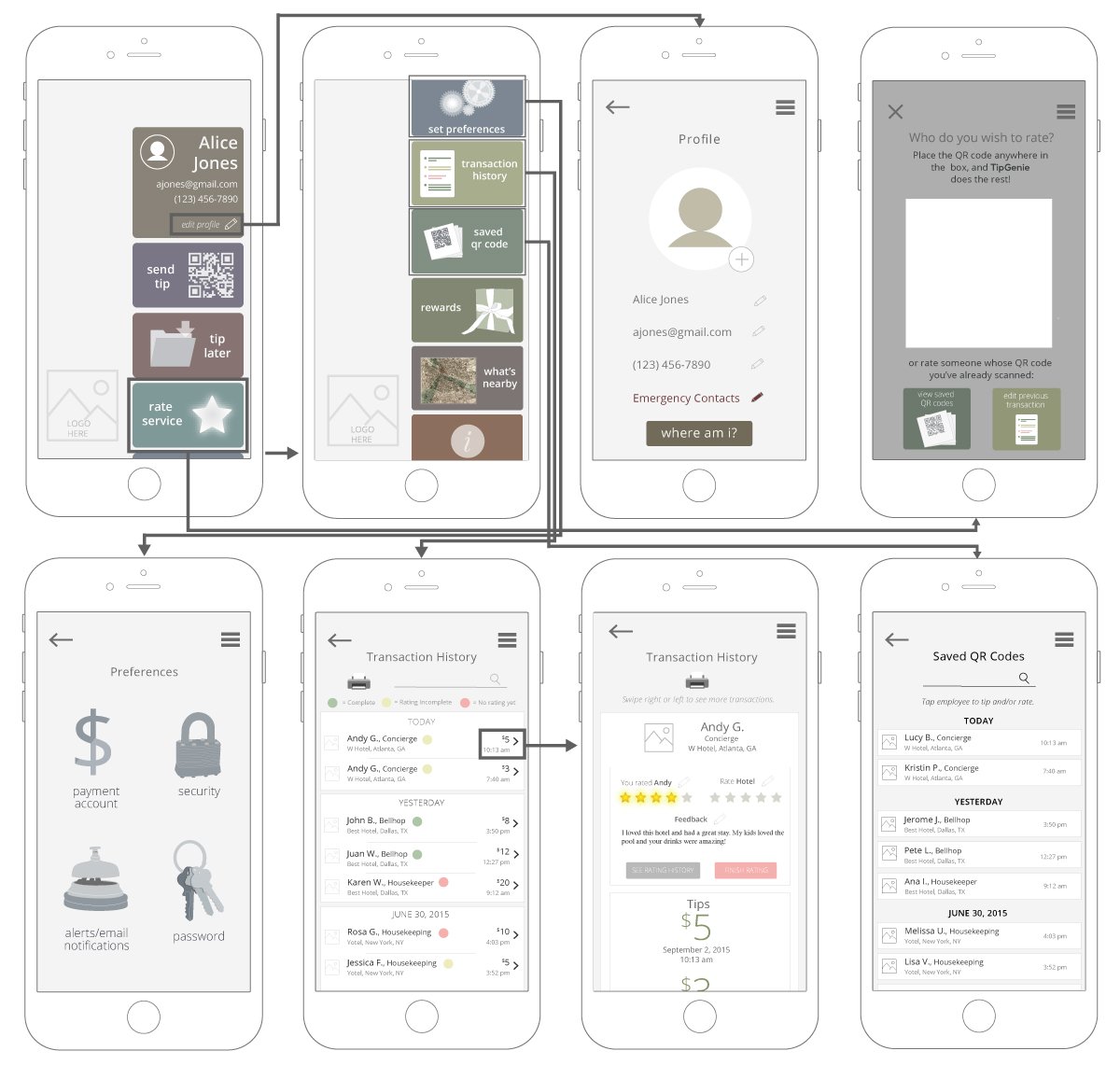
Client: Tip Brightly
TipBrightly provided contactless tipping to hospitality service workers. These are samples from previous iterations of wireframe flows and pixel perfect mock up presentations.

Design Systems
UI COMPONENTS, UX PATTERNS + PALETTES
Design Systems include UX flow patterns, UI components, icons, and aesthetic treatments to provide users with consistent, expectable (i.e. intuitive) experiences across all products and settings.
Client: Aruba HPE
The Design System included guidance, specification and examples regarding:
information architecture and hierarchy
patterns and principles for UX flows
aesthetic guidelines (colors, typography, etc) and how they have been established to support semantics
UI component variations dependent on use states
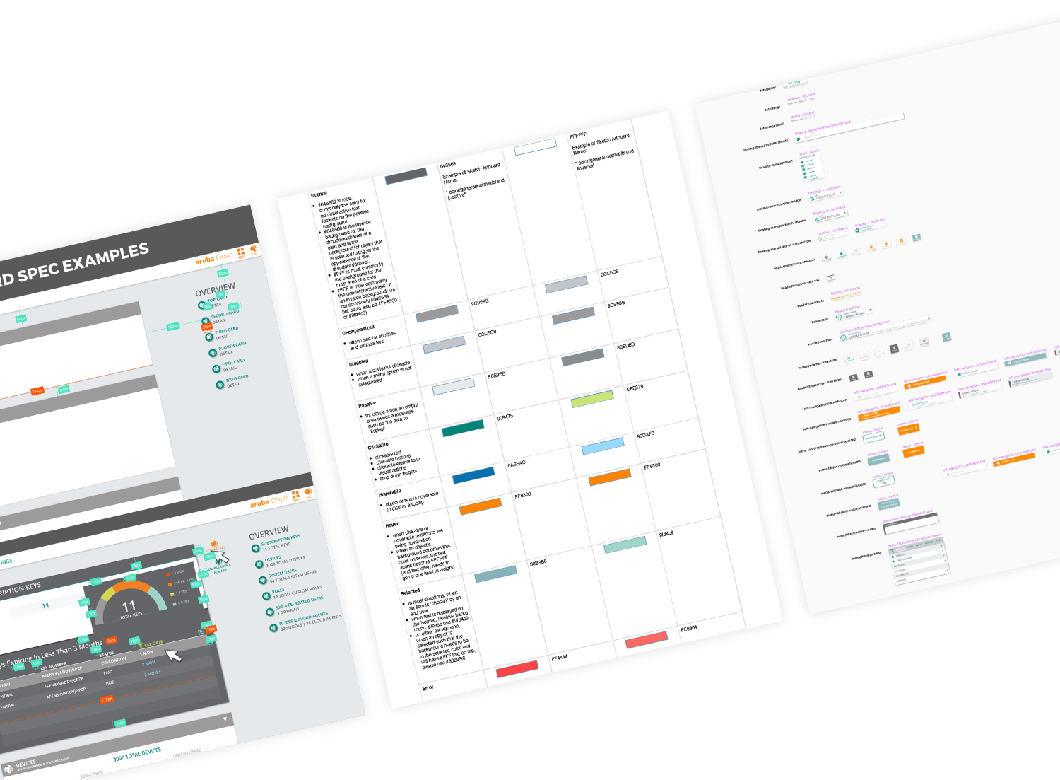
Documentation for current and future designers was augmented by a UI component library of 10 Sketch Library files containing 15,000+ symbols. This extensive library was managed within Abstract, a visual version control system. The documentation also included information about how to use the System, build templates, the philosophy behind flow patterns, and more.
Documentation for PM and Engineering teams included guidance on how to interpret designs and CSS rules.
Please note this system was created before Sketch released their Styles system (and before Figma became a more popular tool) and thus UI component state variations were created purely with Symbols.
Key Challenges + Solutions
The Design System responded to new features and flow requirements while overhauling and instituting consistency in the existing designs of multiple applications. Solutions utilized both technical and social approaches:
Challenges
AND
Solutions
Designers were constantly responding to new product requirements and creating new solutions that required alignment with both established and developing guidelines.
A culture of design reviews and collaboration helped to ensure the work aligned to established guidelines and towards consistent and new solutions in collaboration. This also allowed designers to have conversations about what should and shouldn’t be codified and why.
The Design System should be a growing and collaborative system without dependence on a single person.
By hosting the Design System on Abstract, a visual git platform, the Sketch libraries and files were equally accessible to all designers. Updates to the system and additions of Symbols and Patterns (after collaborative agreement) were transparent changes.
Ensuring the Design System (and all products) aligned with Aruba HPE Branding guidelines.
In addition to working with individual product teams to create aesthetic and functional consistency, the System was informed in collaboration with Aruba HPE’s MarCom department to make sure each color chosen in the System was visible and compliant with their Branding Guidelines. This provided functionality and accessibility across devices and for a wide range of users.

Wayfinding for the Design System
A system doesn’t work if people don’t understand how to use it or where to go to achieve their desired solution. This sample of information was provided to the design team to make sure current and future team members could understand the platforms and resources of the Design System. This meta documentation also included file wayfinding, tips and plugins, and naming conventions to maintain consistency and transparency through the system’s growth.
UX Flow Approach
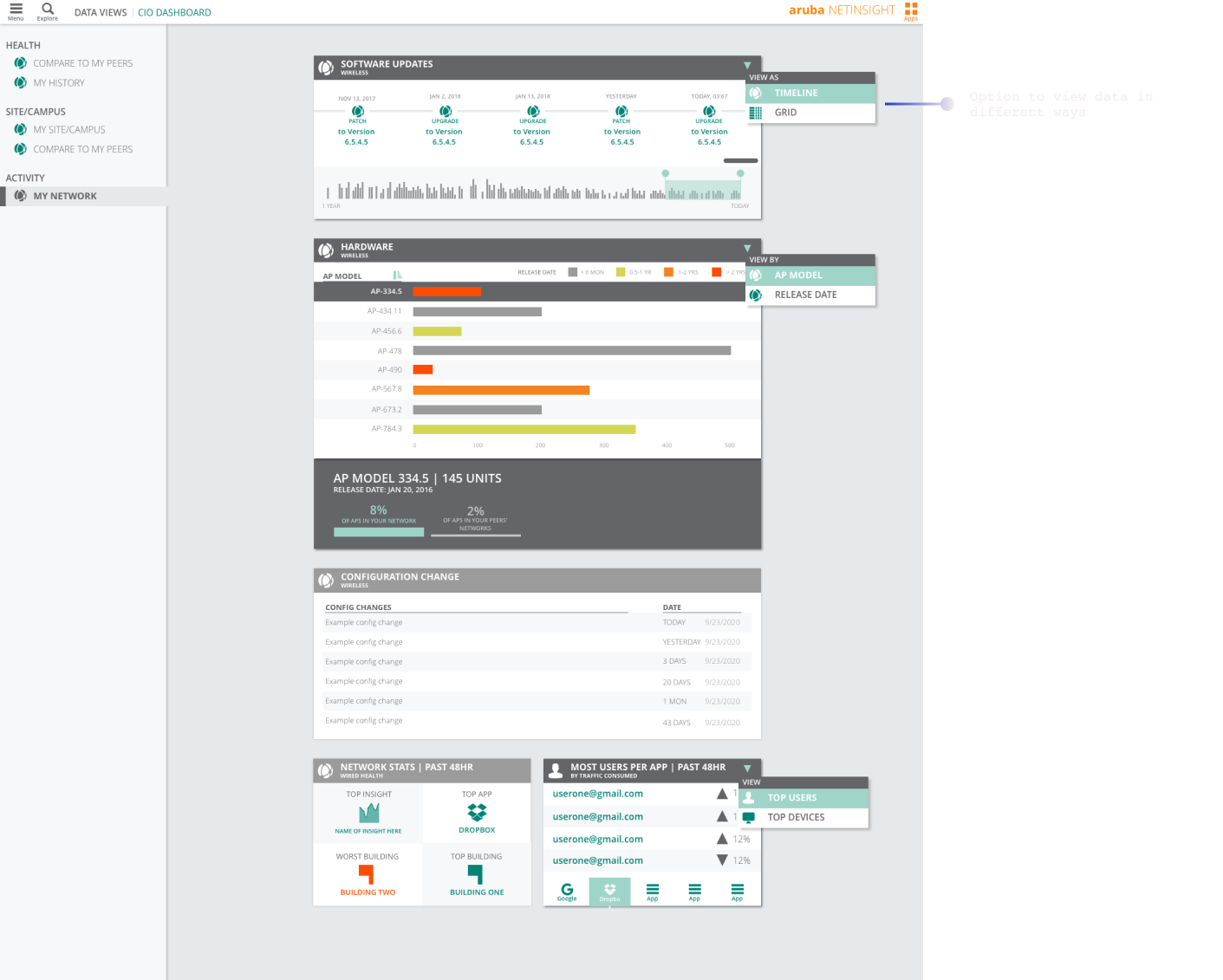
Cards were the central UI and UX vehicles for users to execute information intake, hardware modification, and implementation of troubleshooting. This is a sample of specifications for designers regarding how and when to use which card sub-components. This also included UX guidelines and examples of different ways cards were able to serve different use cases. The cards of the Design System grew to fulfill many levels of progressive disclosure from highly aggregated data (often viewed in data visualization) to disaggregated data (database information viewed in a table format with variable levels of detail).
Form Follows Function
During the process of instituting brand consistency across products, color was a fundamental aspect of this change. In tandem to this implementation, the color palette was expanded and refined to provide aesthetic reinforcement for different use states (e.g. idle and non-interactive, clickable, hoverable-only, etc), which grew in number with new requirements. The “Negative” palette (i.e. how colors looked on a dark background) was developed to respond to users’ environmental preferences. In this palette, specific colors were not just calculated to their inverse, but were carefully selected to align with brand needs and to attempt to accommodate those with low or limited vision.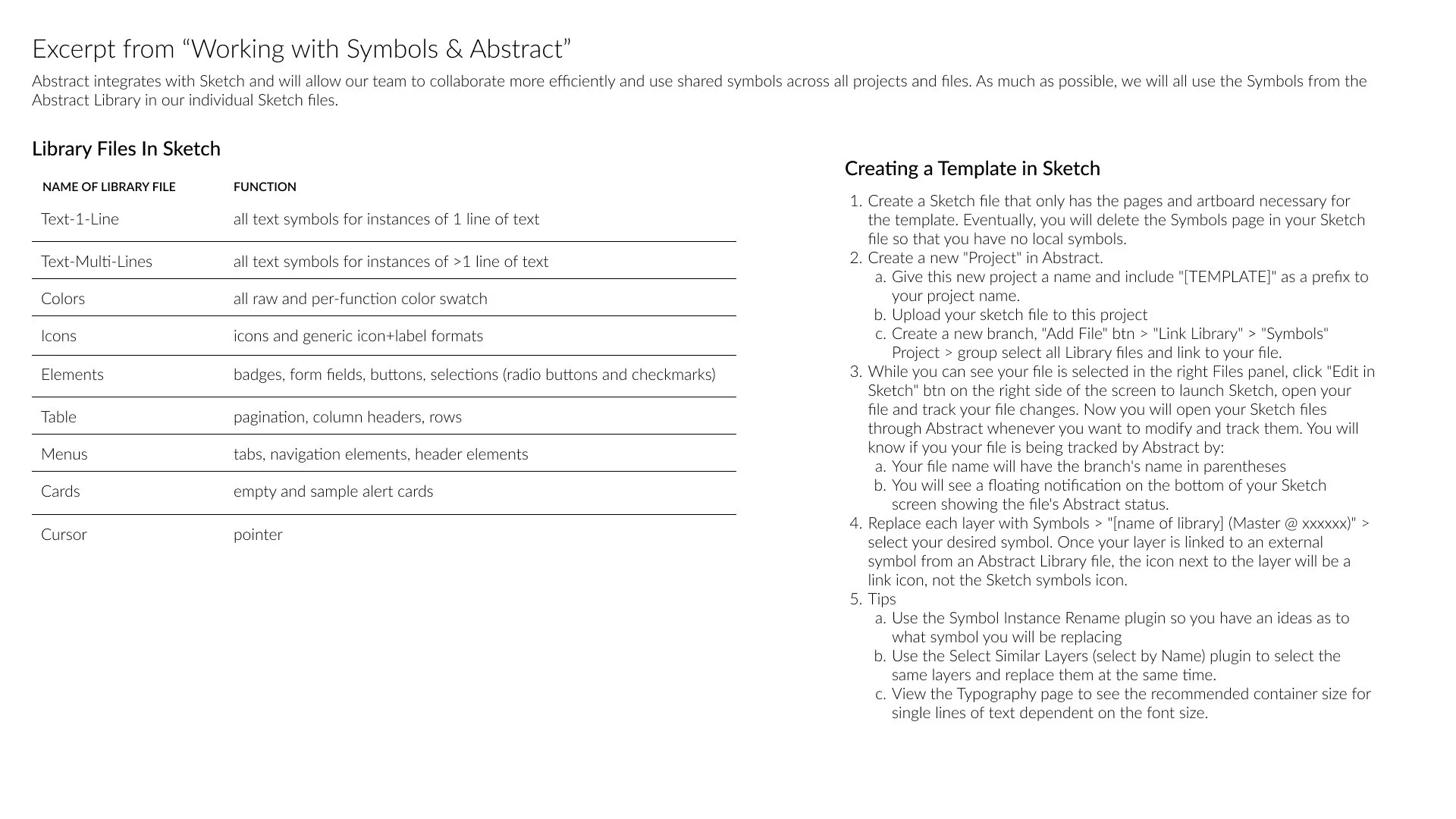
Typography and Elements
These are examples of specifications and screenshots of the component libraries for UI elements. The typography components were the building blocks of the larger, more interactive components such as menus, form fields, etc. At the time, we used components, not styles, to delineate the color, weight, and size of fonts by uses. It was useful to Frontend Devs and Designers to be able to see a “source of truth” without having to manually measure the design file or get confused between Sketch, Invision, current build, etc.
Form Fields
Form fields were one of the most used selection components and their functionality expanded with use case growth.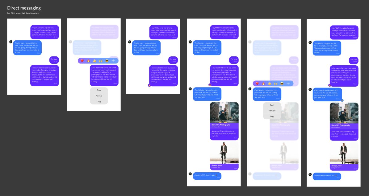
Product Research
Personas, Competitive Research, Qualitative + Quantitative Analysis
We combine our experiences in product creation and marketing with our knowledge of popular trends and cultural history to help clients create personas, audience analysis documentation, and iterative pre-designs that will eventually create strategy and product specs.

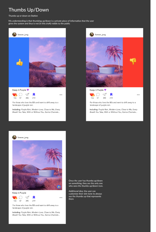
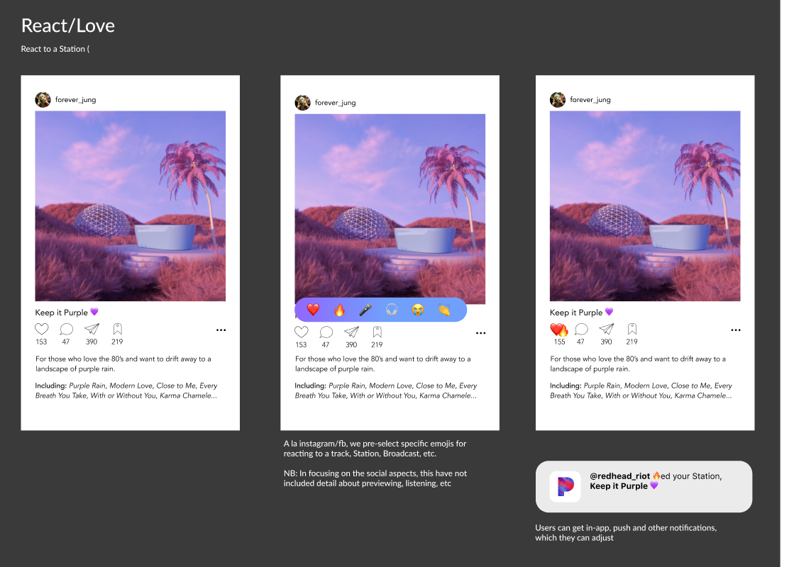
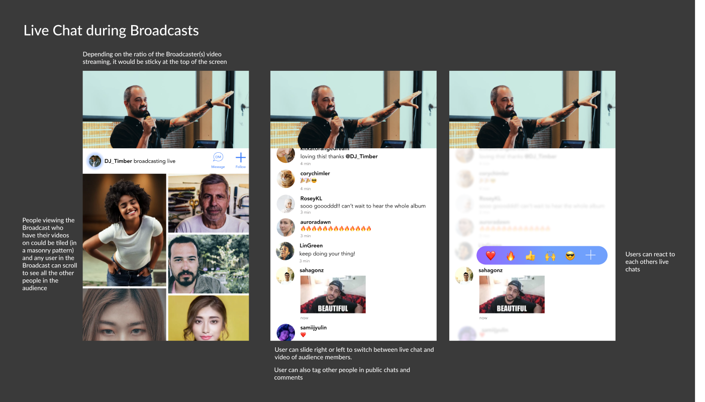
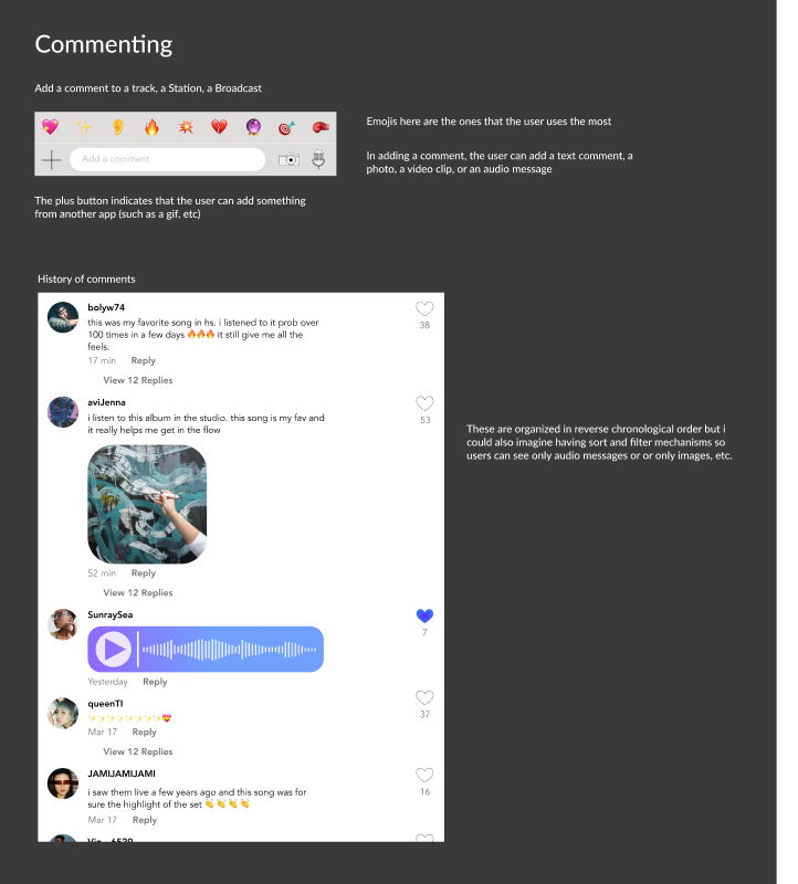
Client: Pandora / Sirius XM
We created personas for a new potential product direction using audience research, competitive research and our own understanding of the market. With guidance from stakeholders, we assembled a persona board that included a framework of user stories and outlined the product features enjoyed by each persona. The goal was to help create the foundation for product specs that would build clarity towards how different users would conceptualize and therefore use the app.
As we worked through the product research phase, we began building samples of how the features could look and feel. Outlined below, are quick mock ups of specific screen interactions that demonstrate what users from our personas would see when exploring different flows and functionality.